
Colour
Introduction
Last updated: 13 January 2026, 13:28 by Daniel Wysocki
The Nordea Design System colour palette provides a versatile range of colours to create meaningful and consistent user experiences. Colour plays a key role in establishing visual balance and harmony across digital services, reinforcing brand recognition and communicating hierarchy.
Principles

Colour plays a crucial role in how users perceive and understand a product. The Nordea Blue Digital Palette is derived from our core brand palette, with blue hues forming the foundation of the Nordea colour system. These are complemented by accent colours and neutral greys to create balance and flexibility.
For data visualisations and insights, we use a dedicated palette designed for charts, graphs, and analytical content. This palette features a more vivid colour scheme to ensure clarity and coherence, especially when applied in stroke-based formats.
Clear Purpose
Nordea Blue Digital Palette
The Nordea colour palette consists of blues, secondary greys, and special accent colours.
- Use blue hues for navigational and interactive elements.
- Apply greyscale colours for text.
- Reserve accent colours for special states such as alerts and errors.
Data Visualisation and Insights
- Prioritise the five primary colours before introducing secondary colours where possible.
- For insight categorisation, use the assigned colour for each Expense Category (refer to the Figma file for details).
Familiar
The colour palette used in our digital services strengthens and reflects the Nordea brand identity.
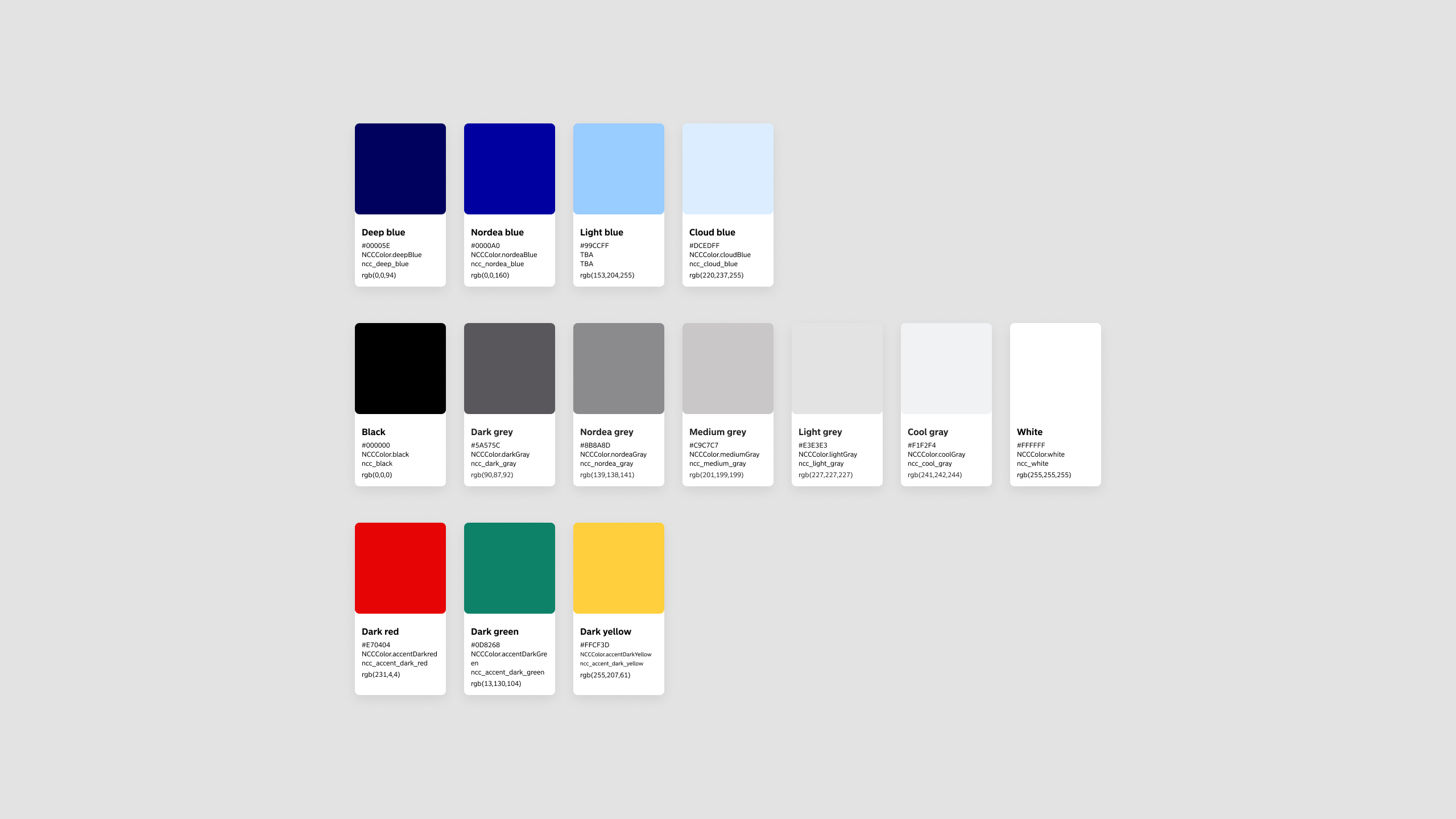
Colour Palette
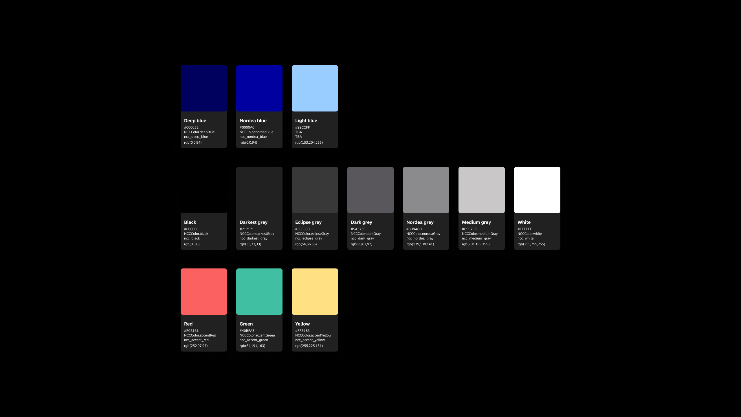
The Nordea Design System supports two colour modes:
Light Theme
- The default colour palette, inspired by the Nordea brand colours and adapted for digital use.
- Includes a range of primary blues, complementary greys, and accent colours for system and UI alerts.
Dark Mode
- A secondary palette designed to reduce device power consumption and improve content visibility in low-light environments.
- Colours are optimised for contrast while maintaining Nordea brand recognition.
- Accent colours are adjusted for better balance and readability.
Both themes ensure a consistent visual identity across digital services while supporting accessibility and user experience.
Light Theme Palette
Dark Mode Palette
Colour Balance

Beyond typography and layout, colour plays a key role in establishing hierarchy within a page. Using high-contrast colour combinations ensures content remains legible and accessible.
Nordea blues and deep blues create a sense of familiarity while emphasising interactive elements against neutral greys.
Accent colours such as reds, yellows, greens, and lighter blues are used to communicate system statuses, including error and success states.
Colour Usage
Informational Accent
- Use light blue tones to highlight tips and informational content.
Critical Error Accent
- Apply red to indicate critical errors that require immediate user attention.
Warning Accent
- Use yellow to display service issues, authentication errors, and warnings.

Guidelines to Follow
Follow these guidelines when applying colour in your design:
Sources
- WCAG 2.1: 1.4.3 Contrast (Minimum)
- What is Color Blindness? Colblindor
Accessible
At Nordea, we strive to meet AA-level compliance with the Web Content Accessibility Guidelines (WCAG) 2.1.
- Ensure all colour combinations provide sufficient contrast.
- Consider users with visual impairments, such as colour blindness, who may perceive colours differently.
- Use colours from the Light Theme palette when designing for the default mode.
- Use colours from the Dark Mode palette when designing for dark mode.
- For data visualisations and insights, prioritise the first five primary colours (Vivid Blue, Blau, Rose, Apricot, Dark Mint) to maintain clear contrast in charts and graphs. Introduce secondary colours only if necessary.
- A contrast compliance table for the Nordea Blue Digital Palette is available in the Foundation Library Figma file, showing ratings against WCAG 2.1 standards.