
Icons
Introduction
Last updated: 13 January 2026, 14:23 by Daniel Wysocki
The Nordea Design System provides an extensive collection of icons designed to complement our UI components and patterns.
Principles
Clear Purpose
- Use icons to provide additional context to interface elements.
- Avoid cluttering the interface with purely decorative icons.
Consistent Shapes and Palette
- Rounded corners or edges should range from a radius of 0–8px/dp.
- Apply rounded stroke terminals for lines with a thickness of 1–2px/dp.
- By default, use Nordea Blue (#0000A0) for icon colour.
Consistent Sizing
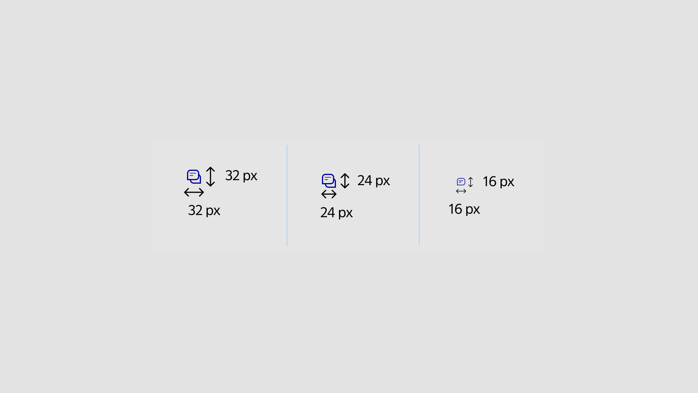
Large Icons (32×32 dp/px)
- Use for clickable icons that require user interaction, such as buttons or interactive elements.
- Include padding to ensure icons are easily clickable and meet accessibility standards.
Examples: Buttons with icons, interactive UI elements.
Medium Icons (24×24 dp/px)
- Ideal for most views and general icons, whether interactive or static.
- Use a 2 px/dp stroke for the main shape and 1 px/dp stroke for internal details to maintain clarity.
Examples: Navigation icons, inline icons within text.
Small Icons (16×16 dp/px)
- Use as decorative elements in warnings, errors, or informational content.
- Avoid using small icons for interaction. They should support visual comprehension and always be paired with a text label for accessibility.
Examples: Status indicators in alerts or info messages.
Guidelines to Follow
Follow these guidelines when incorporating icons into your design:
Sources
- Web Content Accessibility Guidelines (WCAG) 2.1: Success Criterion 1.4.3 Contrast (Minimum)
- Web Content Accessibility Guidelines (WCAG) 2.1: Success Criterion 2.5.5: Target Size
Accessible
- Choose clear, recognisable metaphors for icons to represent objects effectively.
- Ensure sufficient contrast between text and background for readability.
- Avoid using icons as standalone interactive elements; pair them with labels for clarity.
- Apply colours from the Light Theme palette when designing for the default mode.
- Use colours from the Dark Mode palette when designing for dark mode.