
Illustrations
Introduction
Last updated: 5 February 2026, 14:32 by Xavier Bougouin
Illustrations bring a distinctive character to the visual expression of Nordea’s Design Language.
Principles

Isometric Perspective
- Illustrations are created using 2D vector tools.
- Objects are presented through isometric projection.
Consistent Colour Palette
- Use colours from the Nordea colour palette in all illustrations.
- UI illustrations (instructional, error, and empty states) should use a colour scheme that works seamlessly in both Light Theme and Dark Mode.
Types of Illustrations
Our illustrations are available in four variations, grouped into two main categories. Learn more about their types and usage below.
UI Illustrations
UI illustrations should not be scaled and are used at default size of 100×100px.
100×100px
- Use in modals or layouts where illustrations complement the content without overwhelming text or input fields.
Examples: Layouts with 2–5 components, modals.
Types of UI Illustrations
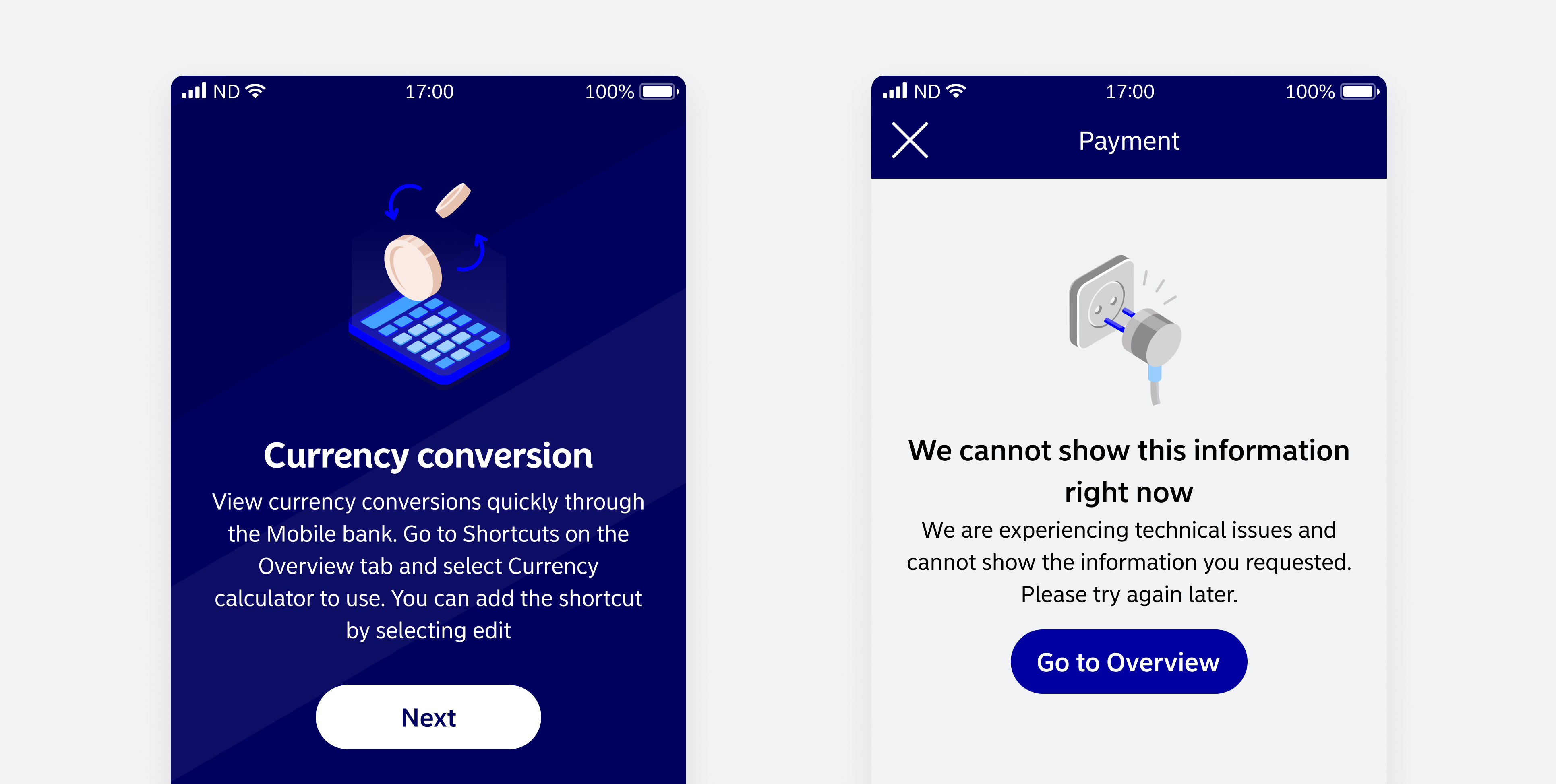
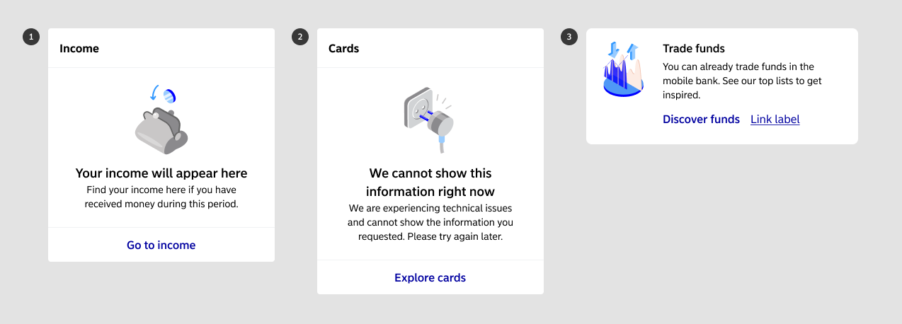
Empty State
- Supports empty state messages when no data is available.
- Helps users understand the context and should feel inviting, not discouraging.
Error State
- Communicates that something has gone wrong.
- Keep illustrations simple and uncluttered for quick recognition.
Instructional
- Provides additional context within flows, supporting messaging and announcements.
The effectiveness of UI illustrations depends on clarity, relevance, and alignment with the overall interface design.
Spot Illustrations
Spot illustrations are small, minimalistic visuals designed for components that support 64×64 dimensions, such as rich buttons. Their simplicity ensures that metaphors and meanings remain clear even at smaller sizes.

Because they are compact, spot illustrations are ideal for space-limited designs where attention is still required.
Examples: Promotional panels, small interactive or navigational elements.
- Spot illustrations should only be used at 64×64.
- They are not a replacement for icons or UI illustrations.
Usage
UI and Spot illustrations should be used exclusively within Nordea Common Components. This approach ensures consistency by:
- Creating a unified visual identity
- Promoting familiarity and meeting user expectations
- Streamlining design and development for efficient maintenance
- Aligning with accessibility standards
All of these contribute to delivering an improved and cohesive user experience.
Contextual Background
Place illustrations in top headers and login views to provide additional contextual guidance.

Guidelines to Follow
Follow these guidelines when creating Nordea illustrations:
Sources
- Freehand Architecture: Isometric Perspective
Accessible
- Choose metaphors that are simple and easy to understand when representing objects.
- Avoid using human figures or characters with human-like traits. Instead, opt for inanimate objects as metaphors.