
Spacing and layout
Introduction
Last updated: 9 January 2026, 13:15 by Daniel Wysocki
Nordea Design System uses a framework of various spacing methods to ensure a predictable and harmonious layout.
Principles
Clear Structure
- Our design system rely on an 8px grid framework. All increments are a multiple of 4px. This helps give pages and forms a consistent visual rhythm.
- Layout of views should be consistent across different pages.
- Establish hierarchy by applying spacing methods.
Grouping and Proximity
- Spacing and grouping can be achieved by adjusting proximity and distance. This is done with white space and if needed dividers.
Responsive
- Design layouts that adapt to different screen sizes and reflow gracefully.
- Ensure design consistency, usability and accessibility at all breakpoints.
Accessible
- Apply spacing methods consistently.
- Ensure clear relationships between elements.
Design Process Step by Step
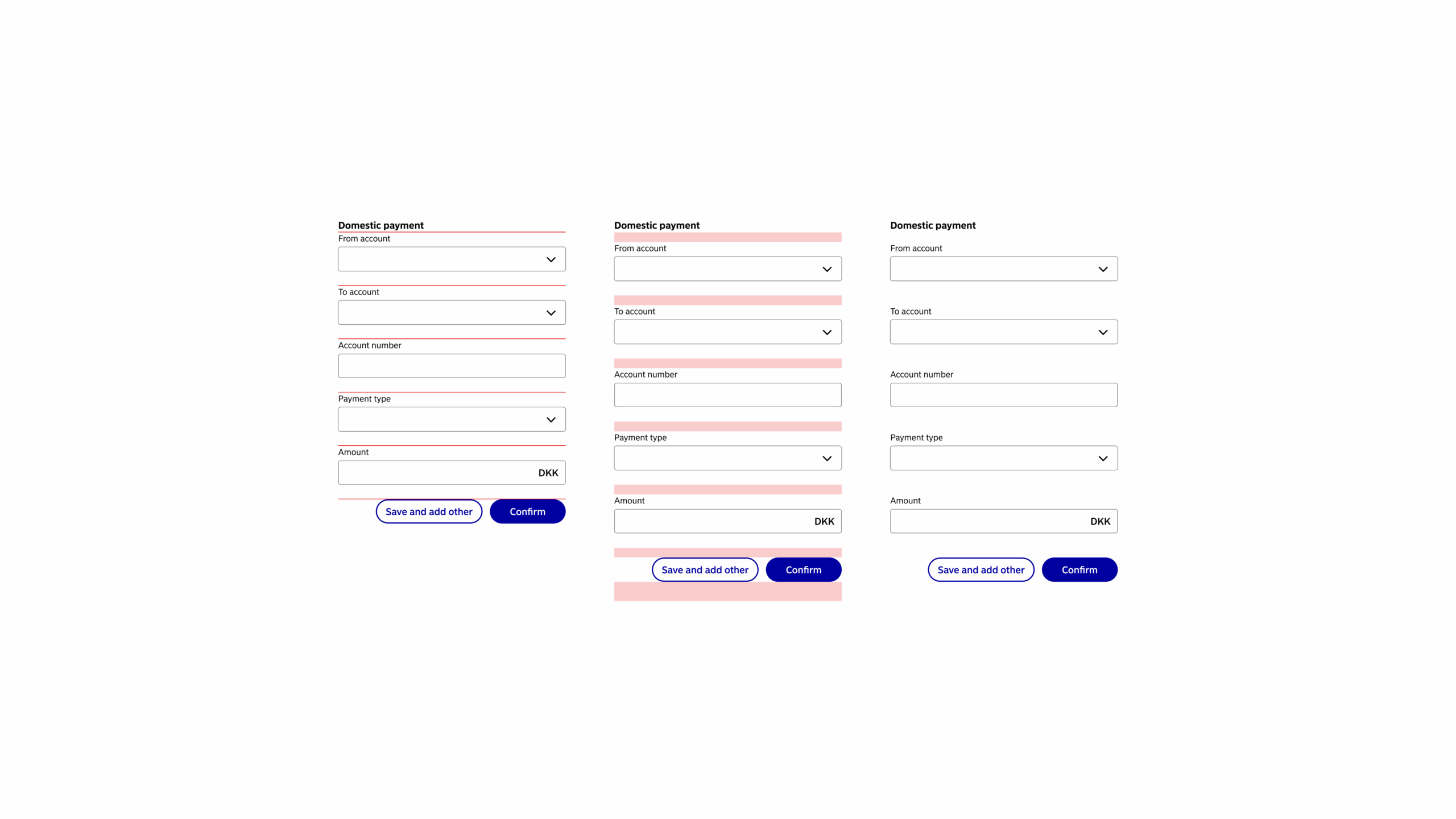
- Start with the stacked components without spacing.
- Add 16px of vertical spacing between components.
- To emphasise grouping, you can add extra spacing below groups when they are followed by more content. Eg. Increasing the spacing from 16px to 24px or 32px.
- Spacing and grouping can be achieved by adjusting proximity and distance. This is done with white space and if needed dividers.
Grid Framework
General Principles
- We design using a 8 pixel grid framework.
- Nordea Common Components (NCC) follow common spacing values.
- Specify margins and paddings for custom components using the common spacing values.
| Token (mobile) | Token (web) | Value |
|---|---|---|
| xSmall | $space-xs | 4px |
| Small | $space-s | 8px |
| Medium | $space-m | 12px |
| Large | $space-l | 16px |
| xLarge | $space-xl | 24px |
| xxLarge | $space-xxl | 32px |
Breakpoints
Use this set of standard breakpoints to maintain layout integrity across screen sizes.
| Breakpoint | Value (px) | Columns | Gutters (px) | Margin (px) |
|---|---|---|---|---|
| Mobile | 320px – 767px | 4 | 16 | 12 |
| Tablet | 768px – 1199px | 8 | 24 | 24 |
| Desktop | 1200px – infinite | 12 | 24 | 24 |
Guidelines to Follow
Sources
- Web Content Accessibility Guidelines (WCAG) 2.1: Success Criterion 1.3.4 Orientation
- Web Content Accessibility Guidelines (WCAG) 2.1: Success Criterion 1.4.10 Reflow